Edward Tufte’s The
Cognitive Style of PowerPoint lobbies some legitimate criticisms. The
medium of visual presentations has always been one that I have found difficult
to approach, execute, or understand. I have routinely been confused by the
formats, particularly the seemingly subjective aesthetic elements, which Tufte
refers to as “Phluff” in reference to PowerPoint. Tufte scathingly criticizes
much of the stylistic aspects of PowerPoint. I have always felt that a great
deal of the effort put into manufacturing a PowerPoint is devoted to
meaningless uses of templates, transitions and rules that limit content. The
focus of this medium is on style that seems fundamentally flawed in delivering
information. Tufte specifically critiques the inadequacy of PowerPoint in
representing statistical graphs and data tables. Dense statistics deserve
adequate representation that cannot be provided by a medium that limits the use
of text. PowerPoint also necessitates the use of bullet points; virtually all
that I have been taught about PowerPoint has stressed the need for conciseness
and limited text. Any attempts to provide a dense body of information through
text or images are fundamentally flawed in the medium of PowerPoint. The use of
bulleted phrases and words rather than complete sentences might seem to
condense information and cue the audience into the most important information.
However, conciseness also eliminates a great deal of information, thereby
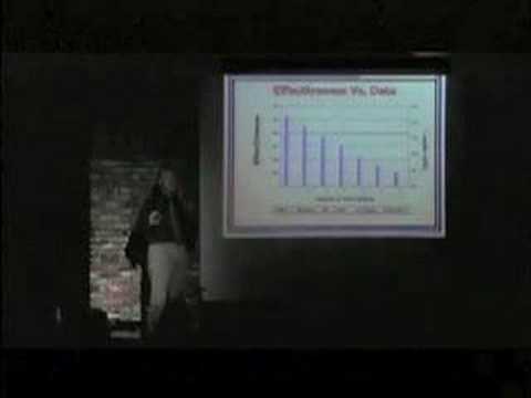
sacrificing content (see Figure 1). The whole mission of the slideshow
presentation is to provide the audience with the most important information,
however I feel that in most cases it merely functions as a tool for the presenter
to organize his or her thoughts and oversimplifies the information. Too often I
have seen presenters looking at their own slides and I have been guilty of this
myself. It is a medium I abhor and in short, Tufte provided evidence to ground
my grievances against PowerPoint.

Figure 1


Add a comment